[ML] 3-2. 평가 - 정밀도와 재현율
정밀도
예측을 Positive(1)로 한 대상 중에서 예측과 실제값이 Positive(1)로 일치한 데이터의 비율
실제 Negative(0)인 데이터 예측을 Positive(1)로 잘못 판단하게 되면 업무상 큰 영향이 발생하는 경우에 정밀도가 중요함 (ex. 스팸메일 분류)
$TP \over (FP + TP)$
재현율
실제값이 Positive(1)로 한 대상 중에서 예측과 실제값이 Positive(1)로 일치한 데이터의 비율
실제 Positive(1)인 데이터 예측을 Negative(0)로 잘못 판단하게 되면 업무상 큰 영향이 발생하는 경우에 정밀도가 중요함 (ex. 보험 사기)
$ TP \over (FN + TP)$
from sklearn.metrics import accuracy_score, precision_score, recall_score, confusion_matrix

def get_clf_eval(y_test, pred):
    confusion = confusion_matrix(y_test, pred)
    accuracy = accuracy_score(y_test, pred)
    precision = precision_score(y_test, pred)
    recall = recall_score(y_test, pred)
    print('오차 행렬')
    print(confusion)
    print('정확도: {0:.4f}, 정밀도: {1:.4f}, 재현율: {2:.4f}'.format(accuracy, precision, recall))
import pandas as pd
import numpy as np
from sklearn.model_selection import train_test_split
from sklearn.linear_model import LogisticRegression
from sklearn.datasets import load_breast_cancer

cancer = load_breast_cancer()
X_train, X_test, y_train, y_test = train_test_split(cancer.data, cancer.target, test_size = 0.2, random_state=120)

lr_clf = LogisticRegression()

lr_clf.fit(X_train, y_train)
pred = lr_clf.predict(X_test)
get_clf_eval(y_test, pred)
오차 행렬
[[39  4]
 [ 2 69]]
정확도: 0.9474, 정밀도: 0.9452, 재현율: 0.9718
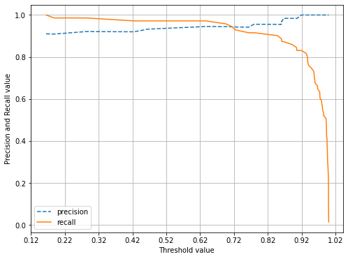
정밀도/재현율 트레이드오프
분류하려는 업무의 특성상 정밀도 또는 재현율이 특별히 강조돼야 할 경우 분류의 결정 입곗값(Threshold)를 조정해 높일 수 있음
정밀도와 재현율은 상호 보완적인 평가 지표이기 때문에 어느 한쪽을 강제로 높이면 다른 하나의 수치는 떨어지기 쉬움, 따라서 두 개의 수치를 상호 보완할 수 있는 수준에서 임계값이 적용되어야 함
- 정밀도가 100%가 되는 방법 : 확실한 기준이 되는 경우만 Positive로 예측하고 나머지는 모두 Negative로 예측
- 재현율이 100%가 되는 방법 : 모든 환자를 Positive로 예측
pred_proba = lr_clf.predict_proba(X_test)
pred = lr_clf.predict(X_test)
print('pred_proba()결과 Shape : {0}'.format(pred_proba.shape))
print('pred_proba array에서 앞 3개만 샘플로 추출 \n:', pred_proba[:3])

# 예측 확률 array와 예측 결과값 array를 병합(concatenate)해 예측 확률과 결과값을 한눈에 확인
pred_proba_result = np.concatenate([pred_proba, pred.reshape(-1, 1)], axis=1)
print('두 개의 class 중에서 더 큰 확률을 클래스 값으로 예측 \n', pred_proba_result[:3])
pred_proba()결과 Shape : (114, 2)
pred_proba array에서 앞 3개만 샘플로 추출
: [[0.08073991 0.91926009]
 [0.00424055 0.99575945]
 [0.99726544 0.00273456]]
두 개의 class 중에서 더 큰 확률을 클래스 값으로 예측
 [[0.08073991 0.91926009 1.        ]
 [0.00424055 0.99575945 1.        ]
 [0.99726544 0.00273456 0.        ]]
from sklearn.metrics import precision_recall_curve

# 레이블 값이 1일 때의 예측 확률을 추출
pred_proba_class1 = lr_clf.predict_proba(X_test)[:, 1]

# 실제값 데이터 세트와 레이블 값이 1일 때의 예측 확률을 precision_recall_curve 인자로 입력
precisions, recalls, thresholds = precision_recall_curve(y_test, pred_proba_class1)
print('반환된 분류 결정 임계값 배열의 Shape:', thresholds.shape)

# 반환된 임계값 배열 로우가 147건이므로 샘플로 10건만 추출하되, 임계값을 7 Step으로 추출.
thr_index = np.arange(0, thresholds.shape[0], 7)
print('샘플 추출을 위한 임계값 배열의 index 10개:', thr_index)
print('샘플용 10개의 임계값: ', np.round(thresholds[thr_index], 2))

# 7 step 단위로 추출된 임계값에 따른 정밀도와 재현율 값
print('샘플 임계값별 정밀도: ', np.round(precisions[thr_index], 3))
print('샘플 임계값별 재현율: ', np.round(recalls[thr_index], 3))
반환된 분류 결정 임계값 배열의 Shape: (78,)
샘플 추출을 위한 임계값 배열의 index 10개: [ 0  7 14 21 28 35 42 49 56 63 70 77]
샘플용 10개의 임계값:  [0.16 0.71 0.86 0.94 0.96 0.97 0.99 0.99 1.   1.   1.   1.  ]
샘플 임계값별 정밀도:  [0.91  0.944 0.969 1.    1.    1.    1.    1.    1.    1.    1.    1.   ]
샘플 임계값별 재현율:  [1.    0.944 0.873 0.803 0.704 0.606 0.507 0.408 0.31  0.211 0.113 0.014]
import matplotlib.pyplot as plt
import matplotlib.ticker as ticker
%matplotlib inline

def precision_recall_curve_plot(y_test, pred_proba_c1):

    # threshold ndarray와 이 threshold에 따른 정밀도, 재현율 ndarray 추출.
    precisions, recalls, thresholds = precision_recall_curve(y_test, pred_proba_c1)

    # X축을 threshold값으로, Y축은 정밀도, 재현율 값으로 각각 Plot 수행. 정밀도는 점선으로 표시
    plt.figure(figsize=(8, 6))
    threshold_boundary = thresholds.shape[0]
    plt.plot(thresholds, precisions[0:threshold_boundary], linestyle='--', label='precision')
    plt.plot(thresholds, recalls[0:threshold_boundary], label='recall')

    # threshold 값 X 축의 Scale을 0.1 단위로 변경
    start, end = plt.xlim()
    plt.xticks(np.round(np.arange(start, end, 0.1), 2))

    # x축, y축 label과 legend, 그리고 grid 설정
    plt.xlabel('Threshold value'); plt.ylabel('Precision and Recall value')
    plt.legend(); plt.grid()
    plt.show()

precision_recall_curve_plot(y_test, lr_clf.predict_proba(X_test)[:, 1])
Comments